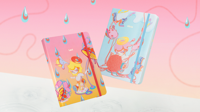
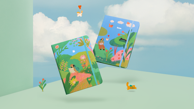
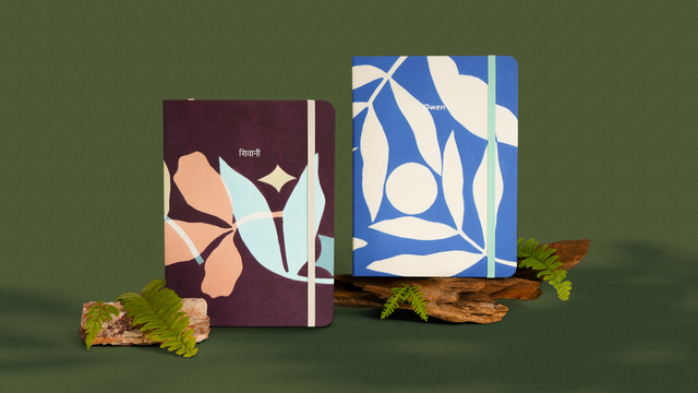
One of the true joys of giving is creating an unforgettable unboxing experience. Last gifting season, we spoke to one of our friends, Magdalene, to collaborate on an idea we had. The result: a beautifully illustrated gift box that’s now in the hands of our customers across the world.
We had the opportunity to talk to her and her colleague, Tsu, about the collaboration experience over a hearty meal, and we also heard more about her recently-launched design studio.
Xin Wei: Hi Mag, could you tell us a little bit about yourself?
Magdalene: I studied design in Hong Kong because I was fascinated by Chinese design and typography. Later on, I worked in a local design studio for three years, where I had plenty of opportunities to apply my design knowledge.
Previously, I struggled between choosing from graphic design and illustration, but in the end, I chose to master graphic design and often figured out how to incorporate illustrative elements into my works.
X: It was a successful collaboration for the gift box! Thank you for that. What do you think was the most interesting part of this project?
M: Well, I think it’s the fact that the final work impacts the audience very directly. Unlike branding work that reaches customers in a more subtle way, this was a collaboration that would result in a physical item. Coincidentally, it’s also because my personal drawing style fits Mossery rather well.
X: Could you tell us what were some of your inspirations for the illustration?
M: Because the overall theme revolved around joy, I integrated what I wanted to draw with this emotion, which were the out-of-the-world flora and fauna elements—they gave me a lot of joy.
X: Were there any challenges?
M: I remember creating the first version with gradient details and thinking it would have looked really good as an individual piece, but when it was placed over the gift box, it looked rather overwhelming, so we altered it accordingly to fit Mossery’s look and feel.
This is also my first time applying such a complicated illustration on a single gift box. It was particularly challenging because I had to contain the complexity and still make it attractive.
X: Did you learn anything new through this project?
M: I definitely learned a fair bit about working with the form of the gift box. For example, I’d never thought of applying gold stamping to the final artwork or connecting the stem of the bird’s plant to the gift box’s string visually.
Tsu: I also think the process for both sides was very organic and natural. We always had an open conversation on adding and removing different elements along the way to form the box into how it is now.
Where’s Gut?
The newly-launched design studio is named after Magdalene’s cat, Gut, which is actually the Mandarin word 桔 (pronounced 'gut' in the Cantonese dialect), which translates to 'Mandarin orange'. The question component of the name was settled to create a sense of quirkiness.
X: Why did you have the idea to establish your own design studio?
M: Mostly because my previous boss always emphasised the importance of having a team. I didn’t really think so at first, but when I came out to freelance, I understood what he had told me, and I wanted to create a space where our creativity could spark and collaborate.
X: What’s your design studio’s philosophy?
M: At the end of the day, it’s really just to finish good work. To contribute to society through design, and to show people the power of branding. Our aim is to increase the quality of branding in the industry.
X: Why do you think people hire you instead of other studios?
T: Right now, people are still coming to us based on Mag’s portfolio. However, unlike a lot of design studios which are creating more generally acceptable designs, we’d like to dabble in edgier things in the future. We hope to go against the grain.
M: I created Where’s Gut? to do silly and fun things so we can attract different kinds of people. I want to be in touch with the wider world outside. To be able to explore and be different in a good way. Not just be different for the sake of being different.
All images were provided by Where's Gut? Design Studio. You can follow them on Instagram or find Magdalene's works here.


